Client: PBS North Carolina Agency: In-House Roles: Art Director, Designer, Animator
Objective:
Craft a kid-friendly identity around the chosen new channel name, Rootle. Incorporate themes tying into the word meaning [to root, unearth, bring to light] and broader Public Television values.
Process:
One of the top priorities for this identity was to create something dynamic and engaging. One of my top inspirations was the branding for Noggin, which I think was pretty brilliant. It creates so many opportunities to be truly creative but also educational, which can be so impactful for a young audience. It provides that little spark that kids can really latch onto.
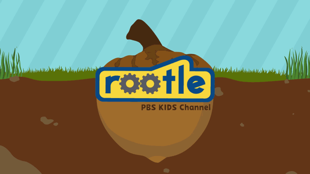
Through the use of elements like the mechanical arms, the logo is able to manipulate objects around it. One of the primary tags shows the logo pulling itself onto the screen, then pulling the url text onto the screen below it. In Read-a-roo’s Block Party it has transformed into a truck with oversized tires, pulling a wagon of books behind it. The result of this technique is an incredibly agile and flexible branding element but also that the logo becomes a character in itself. (In some circles it is known as Rover.)
Font
The Rootle logo was designed without a base font. Instead, I developed a font from the glyphs in the finalized logo. The two ‘o’ glyphs are replaced with gears, signifying thinking and mechanical processes. They also provide a subtle nod to STEM fields, reinforcing the importance of education and the development of skills and interest in technical fields at an early age. The outer shape of the logo provides a unifying boundary and creates a greater sense of weight. It also provides a solid block that can conceal a wide array of objects. Most importantly, it creates a body from which mechanical arms can protrude. These secondary elements provide a great deal of flexibility in the branding, transforming the letterforms into a living creature that can interact with its surrounding and provide endless sources of entertainment and engagement.
Color Palette
A colorful palette sets a cheerful and trustworthy tone:
Yellow: Optimistic, Energetic, Cheerful. Gives an impression of happiness and excitement.
Blue: Trustworthy, Loyal, Peaceful. Conveys a general feeling of acceptance and respect.
Orange: Friendly, Playful, Energetic. Instills a sense of community and confidence.
Elements and Motion
Cogs: spin to add movement/interest; signify thinking, mechanical processes, STEM; function as eyes (blinks/winks)
Outline: a unusual shape for an unusual name; unifies text, creates weight and a body that can contain objects
Mechanical Arm: secondary element to create autonomy, move objects
Custom Font: a pervasice tool for any branding arsenal