The Mad Dollar
- Branding
- April 1, 2016
Client: Self
Roles: Sole Designer
Objective:
Create a brand to encompass creative ventures and hobbies within the crafting and maker realms.

Process:
The hardest part about opening an Etsy store was picking the name. I liked the idea of incorporating my name, but mine happens to already be associated with several chains. (Growing up I answered a lot of phone calls asking if we had glitter.) But my family history helped find a solution.
My father’s initials are M.A.D. He wasn’t the first in his family to have them, and one or two were known to have a temper. One in particular earned the nickname “Mad Dog Dollar,” and it became a sort of family joke. Paired with the allusion to Alice’s Mad Hatter, I’d found the quirky-yet-meaningful moniker I was looking for.

I wanted to keep a connection to my professional branding, so started with Century Gothic as my base font. I decided on red for the primary color, and worked up a few base-level logos. My first needs were a shop icon and a watermark for photos. Simpler would be better.
Illustrations
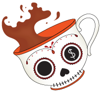
I really needed more to complete the brand. It was created as an avenue for my quirkier creative projects, and it should reflect that. I started working on a series of illustrations that reflected my own tastes and interests. A tea cup solidified the connection to the Mad Hatter, but it needed to have more. I added the sugar skull decorations to give it a more offbeat feel — and to reflect my love of skulls. The cup is tilted, with tea splashing up above the rim, to create a more dynamic look with a sense of motion and energy.


Next up is the Jack-o-lantern. Halloween is a special time for me. I love creating costumes and dressing up. I have a stash of costuming supplies and I refuse to ever wear a store-bought, out of the package costume. Growing up my mother would always make my costume, so it always felt wrong to me. It’s the creativity involved that makes costumes so much fun. I also love the aesthetics of the decorations. I’m one of those people that buys Halloween decorations for year-round use, so anything Halloweeen-related is a good fit for this brand.
